Borderline Press Branding

Borderline Press is an independent small press publisher operating on principles of collaborative storytelling, inclusivity, and empowering community. Current trends in independent publisher branding exhibit minimal graphic elements and emphasize bold typography. It was important to keep these in mind when selecting each element for the new logo, as well as maintaining a high-quality, handcrafted aesthetic.
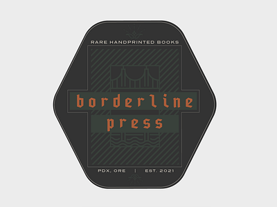
A bridge and river waves embellish the logo emblem, paying homage to the publisher’s birthplace of Portland, Oregon. The logo typography showcases PragmataPro Fraktur, a blackletter typeface that gives a classic, elegant feel and preserves an aesthetic when hand printing or stamping renderings of the logo. Presicav is the secondary font. Muted black, rainy grey, deep forest, and rust serve as the brand colors.
It was a dream working with Alyson, the founder of Borderline Press, on this project, and I am so happy with how everything has turned out. <3
-----------------
Looking for a brand or web specialist? We're now accepting new clients!
Get in touch ----> https://coolcalm.co