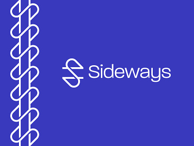
Lettermark S - Sideways
Hi everyone!
Today I designed an exploration logo inspired by a chart movement term that is "Sideways". The concept of this logo is an S lettermark combined with 2 lines. I also designed a pattern that represents Sideways itself. What do you think?
-
Don't forget to like and share your thoughts about this design guys!
-
I'm currently available for work opportunities
Let's connect
More by Faikar | Logo Designer View profile
Like
