John Deere Logo Redesign

Logo redesign proposal for John Deere.
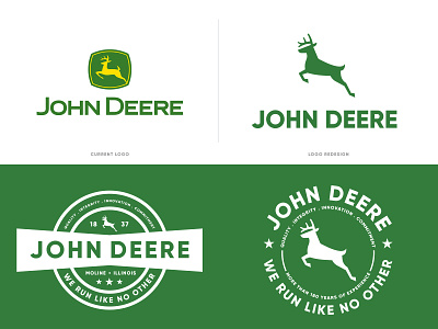
John Deere is an American corporation based in Moline, Illinois and the leading manufacturer of agricultural machinery in the world. Their logo has changed quite a few times throughout the decades but it has been the same for 21 years now.
This redesign is based on their original logo with a few changes to make it look modern, clean and also grown up. Looking at the current logo it looks like a young deer so I decided to design a grown up deer with a stronger attitude. After all the brand has more than 180 years of experience and if you check their machinery you'll see how badass it looks.
You can see more on my instagram: