Deburnay's Dance Centre – Concept 2

Bold/Clean
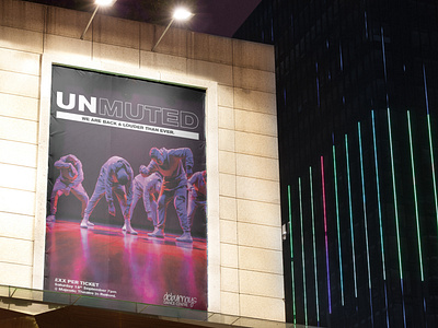
The main photo used shows some live dancers rising, almost as though they are waking up & have been unmuted, reanimated, brought back to life.
This echoes the nature of the show. The typography is a bold extended type that has come back into fashion in the last year particular used in music and other entertainment media.
The word “unmuted” has been split into two parts “UN,” & “MUTED,” UN has been left solid to add more emphasis to the more actionable prefix of the title and “muted has been outlined to lessen its significance & visual hierarchy.
The imagery and layout are very simple and clean which allows the focus to be on the contrast between the two parts of the title.