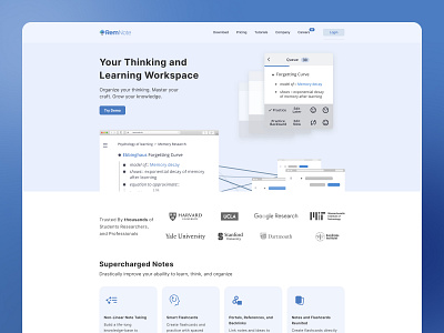
Landing page re-design (RemNote.io)
After (left) <---> Before (right)
A little exercise to work on:
• Teasing continuation (to scroll down)
• Aligning content (makes stuff look cleaner)
• Improving UI design (making it look prettier)
Recently learned more about this in @DannPetty's Course - Stand Out as a
Web Designer (https://designfulltime.com/)
Be sure to checkout RemNote! It's an awesome free tool to quickly and easily make stuff stick in your mind better by creating flashcards.
👉🏻 https://www.remnote.io/
Interested in doing some work together?
Shoot me a message 👉🏻 [email protected]
More by Mike Hanna View profile
Like

