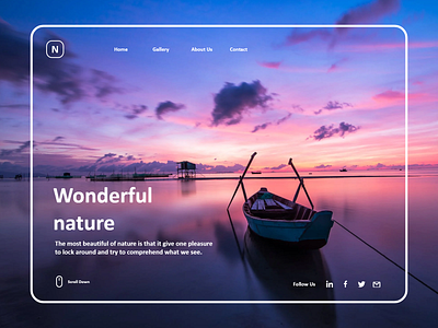
Wonderful Nature
'Sup guys
Trying out some new styles/stuff in the sideproject i'm working on, here's a first version of what the fullscreen menu could look like. The reason why i didn't use a normal navigation instead of this fullscreen menu with hamburger icon is because i want to user to have first of all have a delightfull experience and second of all more impactfull. Having a fullscreen menu with a featured image on hover (this would be a scroll menu, the one in the middle would show a menu) can have a great impact on what the style of the images are gonna be when you click on that categorie. In a quick scroll the user could see all the featured images of the categories and then go into a categorie wich strikes the most interest. This is in fact when the user is just browsing and doesn't have any motivation going to a specific page. Hope that thought process makes any sense haha. Let me know what you guys think! Can't wait to animate this one.
Have a great and productive week guys! Peace ✌
Hope you guys enjoy the classes!
