Savings program for grocery store
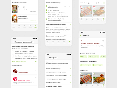
Not so long ago, I made a test task for the grocery store. It was necessary to improve the section of a savings program.
I paid special attention to the content and UX-copywriting, because users need to quickly understand the essence of this program. I am glad to share with you the results of my work 🙌
P. s. I framed wireframes in corporate colors and fonts. I tried to make the section in the company style and similar to the current application.
More by Lena Volk View profile
Like
