Marketplace seller’s platform
The team is available for new projects! Drop us a line: [email protected] | WhatsApp | Website
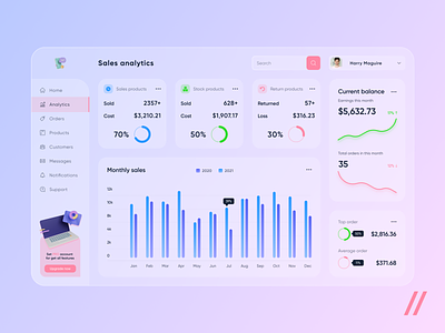
Hello, friends! We are here with our new shot — marketplace seller’s platform
On top of the shot there is sale analytics of:
📊sales products
🛍stock products
🔙return products
In the center of the shot there is a diagram of monthly sales, you can compare them with the previous year. There you can see the most successful month which is compared with the same month in the previous year.
➡️On the right side there is the current balance and dynamics of its monthly growth.
💵 In the bottom right you can notice top order and average order which are both indicated with the ratio of their amount to the total profit.
The style of this shot is glassmorphism. The accent colors are bright pink, blue and green, which are suitable for this style and help to divide all the info into categories 💗💙💚
🤩You can monitor your balance, all the monthly and yearly statistics, find out which goods are sold successfully and which are not.
Press ❤️ if you like our design and share feedback!
P.S. If you want to gain insight into UI/UX design trends, check out our article.
Created by Denis Derbenev


