Crooked Letter Creamery / Unused


Here’s a look at an unused concept for Crooked Letter!
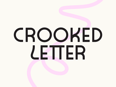
I wanted to show an option that focused on some fun and eccentric type. The wordmark is fully custom and was a really great challenge to get it just right. I wanted to explore a brand that was simple but reflected what was going on in the logo. I landed on some subtle but wonky linework to live behind the typography to keep things simple and clean.
Hopefully I can repurpose some of these letterforms someday!