Jewelry Brand Store Inventory - Dashboard

Hey everyone! This is my design solution for Crowwwn UX challenge.
The challenge: Store Inventory Challenge
As an online store owner, I want to be able to see my inventory as well as how much money I have made, so I can run my business efficiently.
So for this challenge I chose a hypothetical jewelry brand, Finera, which specializes in everyday sophisticated jewelry items.
I chose a soft and soothing theme, consisting of colors, Salmon Pink (Primary), Platinum (Secondary), Raisin Black (Tertiary) (these are included in the logo as well), and Polished Pine and Cadet Blue Crayola for added depictions.
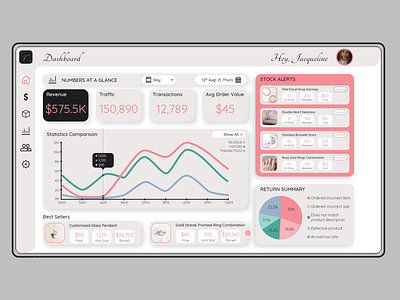
The top bar displays the title of the page the user is on and their profile picture and name.
The left navigation has links to Dashboard, Sales, Inventory, Statistics, Vendors, and Settings.
This is a dashboard where you can get a glimpse of everything important.
All the numbers and statistics of a day/week/month/year. Since it's a glance, it's a basic view of all important KPIs.
Stock Alerts show the products running out of stock and their status.
Return Summary displays the reasons customers select for their return through a pie chart.
I am still learning everyday, hence all feedbacks are welcome so that I can improve upon myself. Thank you!