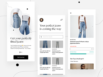
Find my Fit UX case study
Hello guys 👋🏽, I’m here again with a bundle load of inspiration for you ! 😁
Yeah, today’s design is a little bit different. It’s an exercise of bringing peace to online shoppers that find it difficult to get Jeans that fit.
It’s quite a disappointing experience when you have to return an item that doesn’t fit quite right every single time. So I had to create a means to help online customers select the style of jeans that they’re looking for in the right size.
First, I set out with analyzing the problem very well. I differentiated the type of users and cinereous that brought frustration to them based on assumptions.
I hopped on a call with someone with similar situation( user interview). I wanted to get a clearer picture on the journey in her online shopping experience. After our discussions, I created a layout map of the journey stating what can be made better based on the input I got from the conversation.
I hope I was able to bring peace to the person and other online users that find it difficult to find jeans that fit and their right sizes too.
Please let me know in the comments what you think and what can be added !! 😁
I’m super open to this discussion y’all
.
The full version of my process is in my Behance. Check the link below !!
https://www.behance.net/gallery/124639361/Find-my-fit-UX-Case-Study
.
Got a project? , Dm me let’s get started !
