Travel Blog Website
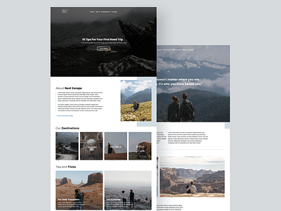
This is a 2-page website that I helped developed in Webflow. The purpose of this concept is to practice arranging my content in order of hierarchy by using column grids. Column grids are not only good for breaking up text, images, and illustrations but using them is part of my design process to make sure my content is organized and easy to follow for the user.
For this exercise, I was exploring column grid properties to improve my hierarchy skills in design. Here are a few things I've learned about column grids while designing the pages: - Designing with grids can greatly speed up and improve your design time. Instead of randomly positioning elements on the canvas, grids act as a guide to help you position and scale elements accordingly while indicating where they should be placed. - Working with grids will make it easier to divide your design up into a certain amount of columns. Not only does this help achieve a more balanced layout, but makes it easier for your users to digest information and imagery without the clutter. - Grids help communicate hierarchy by stretching the more important images across more than one column or row. Imagine this — did you notice how 'Tips and Tricks' spans across multiple columns? By scaling up and extending the block across multiple columns, certain blocks become more prominent (important) than others and draw attention away from other elements. - Most grids have 60-80px column widths. Column width is a key influencer of the width your actual content will be. As you can see, grids serve the purpose of organizing content and are used to guide the designers with how and where to place elements on the page. After reading about grids & layout in web design, not only did I notice my designs improve over time, but I learned that designing with grids help determine better breakpoints for designing on different devices.
See the prototype here: https://travel-blog-prototype.webflow.io/