Move. Then Improve.

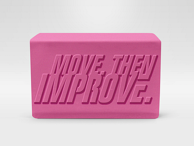
Internal motto about getting things done and out before we try making it all perfect. Progress. Then improvement.
Would welcome feedback about how to help make the letters look more 3d. This was my first attempt at using drop shadow, glow, and bevel to get the raised lettering effect. If anyone has a rec on a good tut I'm all ears!