Design a brand identity for a lemonade stand | Weekly Warm-Up
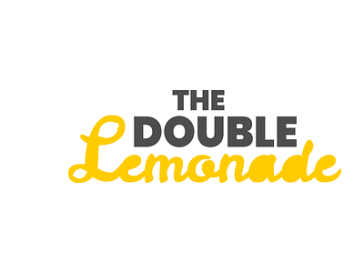
For this prompt I try to create typography style logo design that evoke fun and cool emotion. The Double Lemonade, as the name sound, it's pretty fun for me. The double squeeze on your lemonade adds a funny feel to it.
On the 'L' letter, I try to emphasize that. I also block the hole for other letters to emphasize the lemon even more. On the 'THE DOUBLE' words, I try to make subtle and modern, hence I use simple sans serif font.
Let's work together!
Email - [email protected]
More by Muhammad Hamrozi View profile
Like

