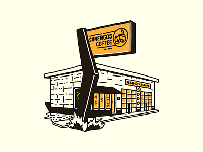
Sunergos on Norris
I was intrigued by some illustrations I saw recently that used minimal colors (usually one or two) and a fairly chunky line and rich shading. They would also often have slightly offset secondary colors, which always feels cool to me. I wanted to give it a try so I drew out my favorite coffee shop.
More by Rachael Sinclair View profile
Like
