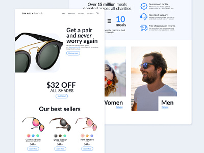
eCommerce Landing Page — Shady Rays Sunglasses Redesign
I went to this design trying to keep in mind product prioritization, I also did a little bit of a UX study on what the differences would be between mobile and desktop in the layout when it came to D2C eCommerce sites trying to build trust in their customer.
If you want to check it out:
https://www.behance.net/gallery/122838567/UX-Micro-Study-Volume-1
More by Alberto Rojas View profile
Like
