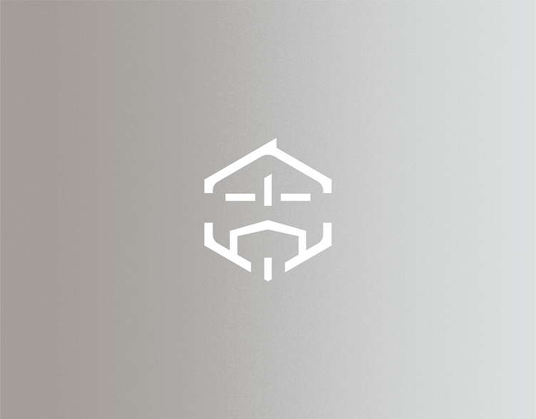
Yong-Gu Development
We framed the logo with a space-sense hexagonal shape. In addition to representing the beehive-like stability, the shape also likes the Chinese character "固" (Gu) itself. The Chinese character "固" (Gu) can be divided into "口 十 口" (square plus square). We turn the inner square as the symbol of a family, while the outer square is guarded by 詠固 (Yong-Gu). Under this mutual trust, we make a better field.
More by Sung, Di-Yen View profile
Like
