SubEthaEdit – New Icon (Draft 1)

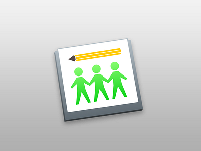
The SubEthaEdit icon has been bugging me for years. It seemed playful and fun, but a little too detailed for my comfort. When SEE version 4 was released earlier today, I was surprised to learn the icon was one of the parts of the app that had not gotten an overhaul.
I thought the little people and the pencil could make for a more modern icon, while remaining distinguished and recognizable. This is my first take at it. I suspect I'll be working on it some more.
I have not put much effort into the measurements and perspective, and they are vaguely similar to some OSX yosemite icon screenshots I found online. Be gentle.