Maná
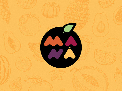
Maná is a brand of handcrafted products.
The colors were chosen to represent the variety of fruits and ingredients that will be used in the most varied exclusive recipes of the brand. Also bring the joy and good vibes of the brand.
The typography was created especially for the use of the brand. It is a modern typography that represents the strength, succulence and flavor of the products.
The Manna in the center of the circle recalls the meaning of the name, food that comforts the soul. The external shape resembles a fruit, the basis for the brand's main recipes.