Byjus App Redesign
Login
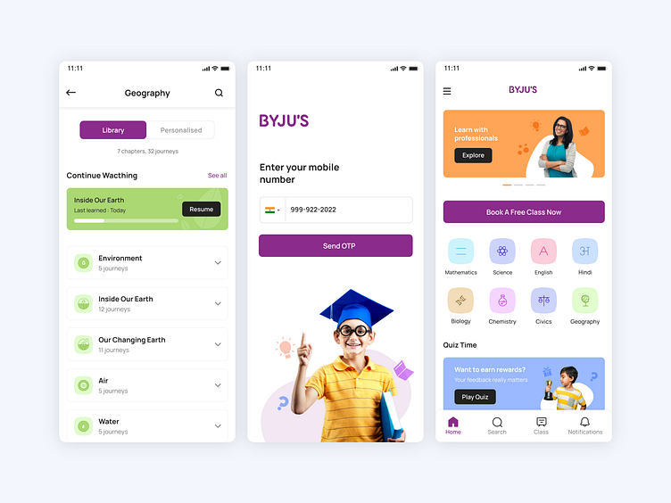
For this screen I have used real Image of a child to make it more impactful.
Home Screen
In this screen I put the banner upfront which will highlight the app updates, offers etc. As user is always excited for new updates.
After that I have shown prominent button of free classes, from where he/she can book their free online class.
I have designed the single stroke icon using different pastel shades to give a minimal and a user friendly look.
For Banners I have also used real images because it gives you more understanding of the application rather than illustrations.
Subject Screen
Here I have done some changes as per my understanding by showing Library and Personalised in Tab view just to create a time-saving design for a user perspective. I have shown all the other information in accordion to reduce the space and to give a proper information on a single view.
Please hit like
