Leiva Estudio - Brand Identity

Brand identity for a family-ran architecture firm from Argentina. Their values are transparency, professionalism and responsibility.
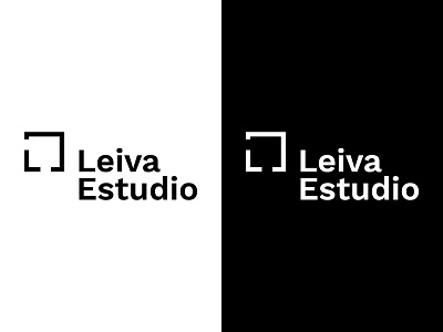
The logo is made up of a rectangle, symbolizing a blueprint design, with cuts on two sides that generate the letter "L" on the bottom left corner.
The cuts on the rectangle that make up the letter "L" represent open mindedness and the ability to think outside of the "box".