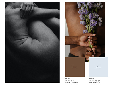
Color Palette for a Skincare Brand
We carefully develop the shades that will fully communicate the brand’s nature, since we claim, the right color palette directly affects the way the brand is perceived by the target group.
Mandal is a skincare brand that uses plant-based and plant-derived ingredients, and so the color palette needed to correspond to that fact. Thus, we’ve approved the soft blue and the brown as primary colors. These shades are nature derived and can be associated with the water and trees. We’ve found the most mindful solution for Mandal that is going to correspond with the target group (the youngest part of Millenials and the oldest part of Generation Z) as well - both colors are a bit muted and pale what makes them look contemporary, exclusive, and unconventional. In terms of the psychological matter, blue shades are normally perceived as calm, reliable, and stable, while the light version of this shade adds some elegance to the overall impression.
For enquiries: [email protected]

