Luu's Logo

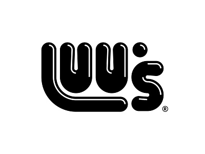


A mock logo redesign for Luu's, a bubble tea cafe right next to my apartment. The place is always packed with local kids, so I aimed to create a bubbly and childlike look.
- The apostrophe shape represents a tapioca pearl.
- The letters and their spacing are all based on the Fibonacci golden ratio to create balanced proportions and visual harmony.
- I made several variants, with a different apostrophe, flat letters, and color combos before settling on a shiny black.