Hydra Fundraising
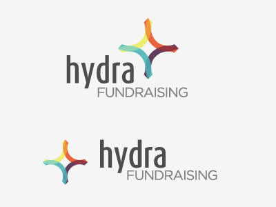
Working on a logo, need ideas/suggestions for how to get the type arranged well with the colorful bit. Also, there are two different versions of the logomark, one that has unique shapes based on the interplay of circles (top), and one thats just masked circles (bottom).
Any feedback would be great :) Thanks!
More by Tony Mamo View profile
Like
