Daily UI 012 E-Commerce Site
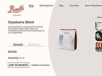
For this, I tried a split-tone page that focuses attention on the CTA at the point of sale.
I added shadows to the certain elements- buttons, brand, product, cart, and "other", while leaving the page text flat. Also, I decided to just lower the opacity to create contrast in the details/delivery section. I think the subtlety gives enough contrast and upholds consistency throughout the page.
As always, any feedback is welcome!
More by Jason Garrison View profile
Like
