Liverpool F.C — Logo Redesign Concept


Hey there!
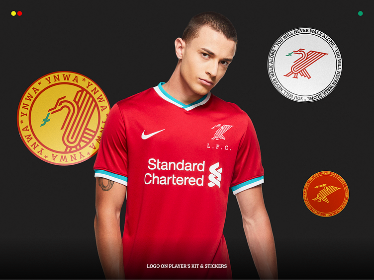
The Liverpool F.C logo has a vast history. We value and respect it immensely, but what if you dream up, follow the examples of Man City, Juventus, Inter, and others who have updated their emblems to keep up with the times?
Meet the alternative modern minimalistic logo of the reds! Naturally, we did not even think about changing Liverbird for anything else. We just presented it more graphically in tight lines and bends. YNWA!