Philosophy database redesign
Client told me that the priorities were: - high-legibility - simplifying the interface - modernizing the brand
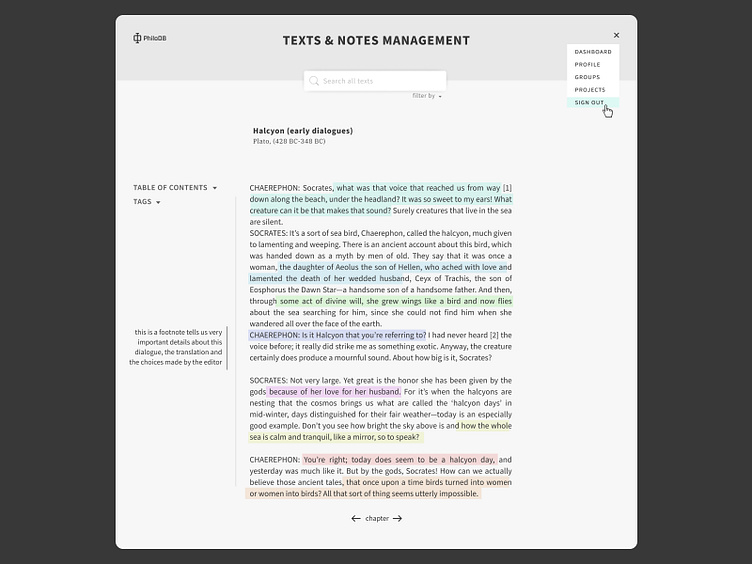
I needed to find highlight colors that looked good together, without sacrificing legibility, and they had to fit the new brand directives. I first explored shades of grey, added this punchy aquamarine as a brand color and chose highlights with lower opacity that fitted new color theme.
I found a techie font for the brand name and made a stylized letter 'Phi" as logo. The body text is clean, with a slight stately air.
I'm very happy with the result! It look calming yet punchy and modern.
More by Summerthyme Studio - Lucie View profile
Like
