drophome™

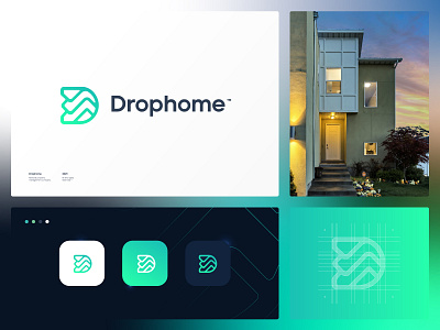
Hi guys! I present this new rental & property brand
management company, the symbol is based on the union of different concepts: A house, the waterfall from the roof and the letter D, giving it a distinctive and unique touch.
I await your comments, I would like to know what projects you are currently working on.
Would you like to work with me? I'm available, just write me here: [email protected]
See more of my work:
https://www.behance.net/vask_
https://99designs.com/profiles/vaskdesign