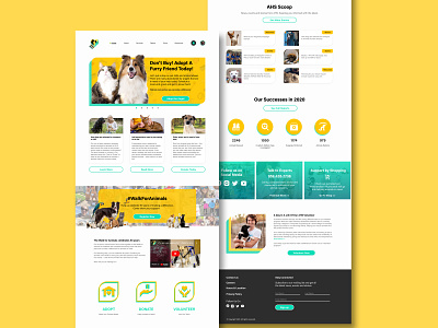
Humane Society Web Main Page
Many animal charity organisation either use templates or inexperienced contract work to build their website resulting in very messy user interfaces or site map hierarchies. Doing my own take of a charitable organisation redesign, I took the liberty to explore colours that represent nature and fun- something to be associated with when helping animals-in-need. Having been a user myself that had once adopted a pet through the humane society, I've also included and reorganised some nice-to-have information that are likely to be extremely useful to users.
More by Dionne Phua View profile
Like
