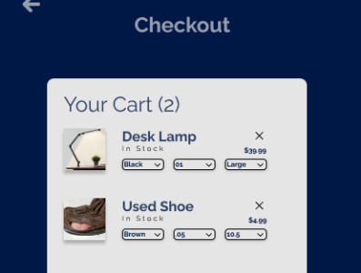
Daily UI 001 Checkout Page
First ever Figma design! These are great to look back on and see what I would've done differently.
I didn't use any spacers or dividers to guide the user's eye. I also used too heavy of a font weight in the dropdowns. The blacks are too stark on the eye, and the corners are not rounded at all. There is shadow on the images, but not in the other elements. I'd try to add some more hierarchy by lightening the checkout and decreasing the font height of "Your Cart"... And there's a lot more feedback to go!
But, props to me for finding the only used shoe dealer around 😂
As always, any feedback is welcome!
More by Jason Garrison View profile
Like
