Daily UI 010 Social Share Button
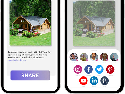
For today's challenge, I added a little flare to the share button by adding a slight gradient and incorporating the brand color. I kept with a serif font to mimic a smart, established, journalistic feel.
For the actual share interaction, I stuck with normal user patterns but incorporated a few design ideas of my own.
First off, I separated the options to share with others from the options to share with general audiences on different platforms. I separated the sections with a very light grey bar to keep these categories distinct.
Second, I decided to go with a darker text for the subtitles of the logos and profile pictures. I wanted to create more contrast so that users could identify what they were reading and which account they were trying to click on.
Lastly, I staggered the icons for legibility so the user isn't forced to look at a block of social logos. This way, the readers gaze is intentionally led one icon to the next, creating contrast and separation.
As always, any feedback is welcome!

