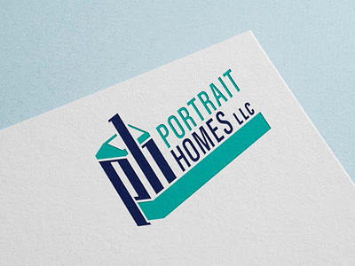
Portrait Homes
You may have heard, we’re living in an era of “flat” design. Long gone are the skeuomorphic clever photoshopped textures of the early 21st century. The design pitch we were sold was that flat designs are simpler and more intuitive, though emerging research has put that idea up for debate. Brands have long been flat though, as their simplicity equates to universal ease of use across different media. But just because a brand is flat, doesn’t mean it is truly flat. Take the isometric logo for Portrait Homes. Set on a a 30 degree grid, this logo has depth and a dynamic edge. Flat doesn’t have to mean boring.
More by Josh Gilmer View profile
Like
