Korean Cultural Center PH - 10th Anniversary Logo Redesign
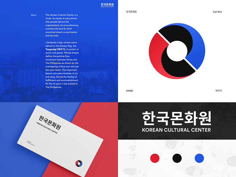
The Korean Cultural Center is a circle. Its center is everywhere (the people behind the organization), its circumference, nowhere (its love for both countries knows no perimeters and bounds).
I designed a logo whose colors adhere to the Korean flag, the Taegeukgi (태극기); A symbol of purity and peace. Whose shapes define the positive flow movement between Korea and The Philippines as shown by the overlapping of blue and red over the color black: The important, lesson-rich past mistakes. A yin and yang. Giving the feeling of fulfillment and accomplishment for the 10 years it has existed in The Philippines.