Cycling infrastructure metrics visualization

A promotional social media design I've done for CicloMapa, a web app I designed and built to make bike maps in Brazil more collaborative and accessible.
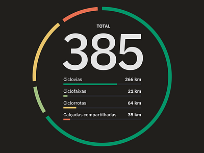
This design, an more "artistic" rendition of UI design, represents one of the main new features we're launching: the automatic calculation of the total length of different kinds of cycling infrastructure.
I wanted to not only show the total length of cycleways, cyle tracks, shared lanes etc. but also represent in a very visual way how these different types of structure make up for the total of a particular city. Because it doesn't matter much if you have hundreds of miles of shared lanes and almost no protected cycleways, since you're not providing the safest structure to the cyclists.
Kudos to the people at IBM who design the awesome Plex typographic family. This is one of those fonts that is SO good that you don't believe it's actually free hahah
__
I'm a very technical designer & developer looking for improving my visual design chops, so all CC very appreciated!
→ Read the case study: https://cristianodalbem.com/ciclomapa/
→ See it live: https://ciclomapa.org.br