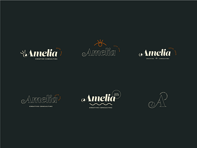
Logo Iterations and alternative logo marks.
My process
BRIEF
This was a fictional project but the brief was to give a brand identity to a Business Consultant for Creatives. Amelia had never had a visual identity yet for her online business. She wanted something that was simple, natural and with a bit of flair. She wanted physical business cards so she could refer people she met to her online business so that was one of my main focuses during this project.
CHALLENGES
The biggest challenge was keeping it simple and minimal without it being boring. So often, you can pair things down so much that it just feels more bare than minimal.
GOALS
The goal was to give Amelia a natural, earthy yet minimal and modern visual identity for her personal brand. I gave her some stationary so she could fully “live” in her brand when she’s at her desk on her computer.
UNIQUE SOLUTION
The solution I created for her was a visual identity for her earthy, creative, modern yet professional brand. Focusing on her business card with some stationary was what she wanted. I also gave her brand colors and fonts that she could use going forward in her business.
