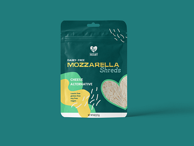
Last Shot of the Mozzarella Shreds Packaging

My Process
BRIEF
This (fictional) rebrand of a real company’s brief was to redesign one of their main products. They also needed an in-depth brand redesign and logo redesign. Their existing packaging was outdated in style and less appealing to their consumers.
CHALLENGES
One of the biggest challenges was using abstract shapes in the design for this alternative cheese packaging. I ended up using a simple pen tool curved line as the cheese shreds which ended up working out visually and made sense for the goals of the brand.
GOALS
The goal was to recreate their existing packaging to make it both eye-catching as well as easy to read from a distance. The goal was also to recreate their logo and incorporate it into their packaging. Overall, they wanted an appealing, updated colorful packaging for their brand.
UNIQUE SOLUTION
The unique solution, which I came upon through research was to create the graphic elements and play around with the fonts until I came up with the solution. It’s a design which is appealing, fun and colorful! The ‘Jangkuy” text gives an earthy, down to earth feeling to the new rebrand as well.