Font and Color Brand Guidelines for Jazz Festival Brand

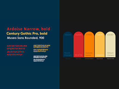
‘Ardoise Narrow, bold’ was used as the font for ‘Jazz Festival’ but was manipulated using the warping tool afterwards. The other fonts I used were all sans-serif fonts as well. I used them because I wanted to appeal to the avant-garde, modern concept you often see in jazz.
Also, you’ll notice here that all of the colors have names I gave them- all based on jazz classics from some of my favorite jazz artists (Cannonball Adderley and Thelonious Monk being my favorites out of this grouping!). Orange is very vibrant and reminds me of the zest for jazz that jazz musicians have for their craft. Blue is very much associated with jazz and red stands for jazz musicians dedicating themselves to their passion.
My Process
BRIEF
This was the first project I completed as part of my certification process for NYIAD (New York Institute of Art and Design)’s graphic design certificate. The brief for this project was to create a poster design that explored my understanding of the elements and principles of design specifically emphasis and unity. It was the first exploration in the online course of design theory.
I furthered the brief from the original assignment to mean this; a (fictional) jazz festival needed a rebrand that was fun yet timeless and would appeal to a wide age range as this festival is for all ages and meant as a way to bring the community together.
CHALLENGES
The biggest challenge was coming back to this project once I had completely the poster about a month ago and needing to repurpose the design across ticket design and billboard design as well.
It can be challenging getting all the elements so it feels consistent and on brand but also fitting the dimensions of whatever you’re designing for (a billboard, poster and ticket in this case).
GOALS
My goals with this project was to create a bauhaus-inspired colorful poster and design that encourages fun, summertime good vibes + does justice to the feeling of jazz (as a jazz lover myself, I wanted to convey this particularly).
I also wanted to have the “client” have a rebrand through their color scheme, brand fonts and basically give them a facelift across the board for their festival brand.
UNIQUE SOLUTION
My unique solution has its’ roots in, as all work I do, research. Researching gives me the path forward. A color scheme that is essentially red, yellow and blue can sometimes come across as childish if the design isn’t more thought out and mature.
The solution strikes a balance between fun playfulness yet is still organized in terms of hierarchy of the design elements. I added in the tickets and billboard advertisement to add variety to the rebrand so we can really imagine the rebrand in reality.