Arrowhead Church App - 2021 Redesign
In early 2021, one of my major projects was to redesign the Arrowhead Church app. You can read the full story and process here (https://jaredbelcher.medium.com/designing-a-church-website-app-for-2021-5a3874443dd4) but this is a quick explanation of the user interface.
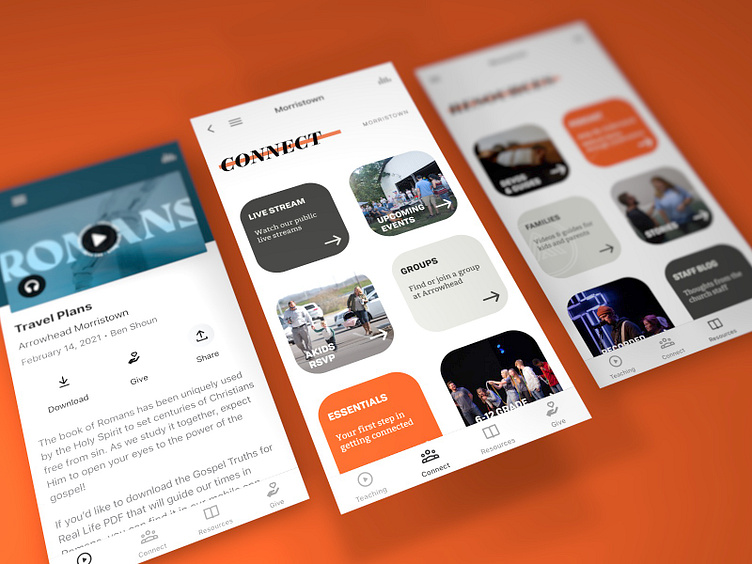
A month ago, my wife and I had written a guide for the interior design of our family home, and it occurred to me that the same principles we had written for our home would actually be really neat in an app interface. Consistent containers, a bright room, bold and black type, lots of negative space, sparse use of bold color, cohesive colors between sections, alternation between photos and plain colors, and crisp lines. It’s a very minimalist aesthetic and I feel a little selfish with the art direction (in that I just made what I personally would want to use).
We build our app on the Subsplash platform, and one of the wonderful things about Subsplash is that it provides a lot of customization for a templated product. One way we have always taken advantage of that is by designing our own buttons within the app. To get the desired look of this redesign, we created a file in Adobe Illustrator for all the button styles and exported them as JPG assets for the app to use.
