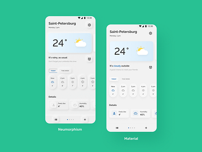
Stormy — mobile app
The weather forecast app is presented in two styles: Neumorphism and Material design. For me, the second option looks clearer and easier to interact with.
Maybe Neumorphism was interesting as a concept and looked nice on Dribbble shots, but this style is hard to implement in real apps and it has to improve a lot in terms of accessibility.
Do you still like to experiment with Neumorphism from time to time? Maybe soon we will see a new and more user-friendly iteration of it.
More by Valeria Kovaleva View profile
Like
