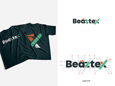
Beaztex Logo - Digital Marketing Consultant & Advertising Agency
My first project in 2021 😎
The exclusive wordmarks logo with precise adjustment and shaping. I create some shaping which place on 50˚ that represent the stable growth & sustainability 🧐 Moreover, each of the colour symbolize the company itself which are: navy pastel, wise and firm ; tosca, professional but not stuffy ; orange, optimistic and creative 👌🏻
Oh ya, we pronounce the brand as; 'biz-tex. It sounds like the 'a' has been omitted. That's why I put a diacritic accent on the top of the 'a' ✌🏼
Feel free to leave some feedback & don't forget to hit the like. Don't worry, you're allowed to share this logo to inspire everyone 😉
Best Regards,
DJocker
More by William Salim (DJocker) View profile
Like
