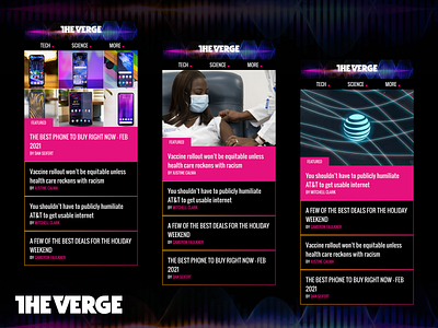
The Verge Featured section
Hi Dribbblers,
Hope you guys are doing well. Here is the Sunday shot.
I love The Verge because of its brilliant design and quality content. I was going through the mobile design and I thought their Featured section could have a flip text card. It's basically a vertical text scroll with a horizontal image moving on the left.
Credits to the Original Creator
Don't forget to tell me which of the idea you like the most. Try to give me feedback about what you have learned from this and how can I improve it more.
Hit 'L' if you like it.
Follow for more design ideas and concepts.
You can also follow me on :
Follow me on: Instagram | LinkedIn | Twitter
More by Muajeez Aafaque View profile
Like
