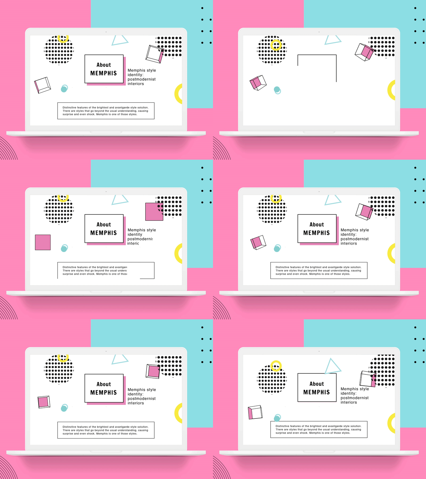
Animation Article Page About Memphis
Look full project on my Behance https://www.behance.net/gallery/112565831/Article-Page-I-Memphis-design-I-Concept
The task is to make an article about the style of the 80s “Memphis” for online digital media. The article’s function is to tell informative the story and characteristics of the popular Memphis style, using its style when creating an article design for the Desktop and mobile versions.
We combine the minimalistic design of the article with “soft” colors, animation of geometric shapes, patterns, and clear grid lines. The article also features white space for better readability.
We chose the “Helvetica” font for the key text, as it is multilingual and easy to read.
The color scheme comprises pastel shades, considering the extensive use of the article in various media. We used safe colors (to cover the maximum range of multimedia devices).
