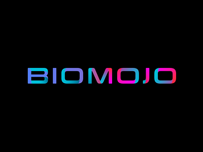
Rejected Brand Identity Candidate
This was the 3rd time the client came back to us over a 14-year period to design their brand identity.
BIOMOJO deals a lot with the U.S. Military so they wanted something a bit stronger in style. Which they got. But that doesn't take away from us loving this candidate in the slightest. Deploying modern trends of bold, vibrant colors with hints of gradients and subtle depth. Because it wasn’t selected, we didn’t have a chance to fine tune her like we would have wanted. The potential for this style is endless. She’s a beauty.
To see more of the project go to: https://www.theskinsfactory.com/biomojo-brand-identity-design
For world-class UI/UX design head over to our main website: https://www.theskinsfactory.com/
More by The Skins Factory View profile
Like
