Devils Gate wrap-around label
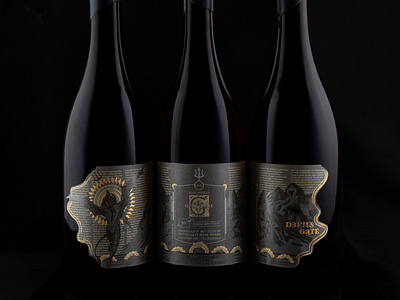
The burgundy version of the packaging design for Devils Gate winery. Like many more complex illustrative labels, the burgundy and bordeaux bottle versions are completely redrawn.
We used metallic ink on black paper to get the opacity we needed for readability. It doesn't look metallic-metallic IRL but there is a subtle glimmer. The real metallic effect is in the foil accents.
