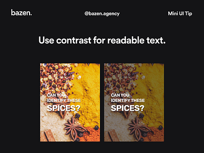
Mini UI Tip - How to set readable text

Getting back to basics from time to time is actually a great thing to do 🙃
_
Be sure that you've highlighted your message in the right way. You have chosen the right font, the background you like, set the layout perfectly! Now make sure that message really stands out by adding a little contrast 😎