GM General Motors Monogram Logo Mark Redesign

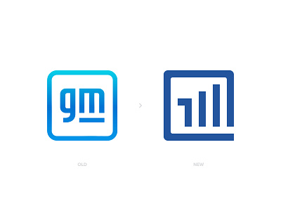
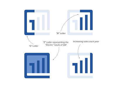

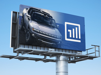
GM recently updated their logo. I think we could add more to the current design.. With my new design approach, I combined G letter + M letter + E letter for "Electric" and an increasing bar graph that represent soaring sales..
I also hate the gradient look on the logo.. So I used the blue they were using on their older logos.
Let me know your thoughts please, its always great to listen your feedback 🙏🏻
Please Hit " L " if you liked my work, helps alot 🙏🏻 Thank you for your support..
------------
http://www.designermurat.com
[email protected]
Need a new logo design? Email me or visit my website to see all pricing and packages I am offering in detail..