Kame Showcase

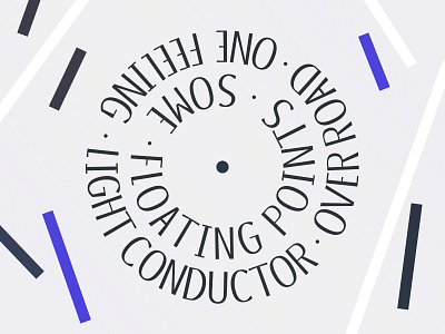
Kame is designed as a hybrid and mutating font with three weights. Sharp, legible and performative, it brings trouble into rigid and strict compositions. Both Poster Regular and Poster Black weights allow for cascading sentence arrangements and bring importance to readability. At last, a lowercase, Kame Book, complete the family for basics texts uses. Inspired by humanist serif and modern angularity, it cut through letters, lightening their display.