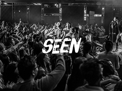
Art Direction: "Seen" for P2CPLUS
For a conference with the theme "Seen", I came up with the art direction and branding. I developed a typography based wordmark that had a hand-painted feel, and paired it with black-and-white photography and imagery that was high-contrast and high-detail, to emphasize that "every little detail is seen" (referencing HDR black-and-white photos of human portraits).
Resulting assets included videos, screen graphics, website and web marketing, print handbooks, name tags, speaker intro videos, and postcards and posters.
Photos by Leemarc Lao, Deb Wong, and BN.
More by Silas Wong View profile
Like


