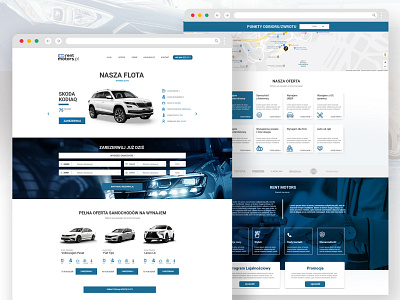
UI & UX rebranding for rentmotors.pl
Hi Dribbblers!
Here is my website rebranding proposal.
The previous page of the client was incoherent, it lacked a logical sitemap and the key informations was hidden in subpages.
The goal of the new website was functionality and cleanliness. The design was limited to two main colors, white and blue.
The new page was made on the onepage template so that all information was available to the user when first viewed
Thanks for watching!
More by Damian Siekierka View profile
Like
