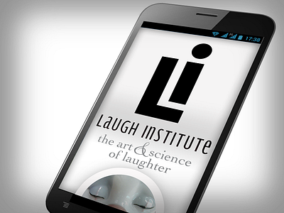
Laugh Institute, Mobile Web { Responsive Design excerpt }
A simple layout design concept for the mobile web version of my thesis re-write online experience.
I am approaching the design from a Mobile First perspective, each chapter in the thesis represented by the circular image stack below the logo and tagline for Laugh Institute.
More by loususi View profile
Like
